Contents
- 1. Thumbnail boards: how to prove you think in beats, not just draw
- Example: a beat-driven five-panel sequence
- What makes a strong thumbnail sequence
- The upgrade: take it from boards to timing
- The mistake that kills this section
- 2. Traditional boards: how to prove you can stage a whole spot
- Example: a 30-second SaaS spot, staged to shoot
- Three things to study in every board
- Building the version that gets you hired
- What kills a traditional board
- 3. Photoreal and CGI boards: how to show a client "the final" before anyone shoots
- Example: locking a look before a shoot day is booked
- What to study in a photoreal sequence
- Presenting this without faking a shoot
- The gap most competitors skip: AI-assisted storyboarding
- 4. Animatics and social-first boards: timing is a creative choice
- Example: a nine-second vertical spot, timed
- What an animatic catches
- Why social and UGC ads board differently
- Presenting this as a portfolio piece
- Frequently Asked Questions
You've sent your portfolio to five studios this month. Three never wrote back. The other two said “solid work” and nothing else — no callback, no notes on what to fix.
Your drawings are fine. That's not what's holding you back.
What's actually wrong is harder to name. Your portfolio just feels... off. A row of nice images, but not production-ready work, and you can't quite put your finger on why reviewers keep passing.
Here's the deal: some storyboard advertising examples sell ideas — polished, the kind that get clients nodding in a room. Others are purely functional, guiding a shoot: what to film, when, how much it'll cost. Most students only practice the pretty ones and skip the practical ones. Then they wonder why studios go quiet.
This breaks down four types of advertising storyboards — what each one actually does in real production, and what's worth borrowing for your own portfolio. Not theory from a design blog. Twenty-five years of reading boards for a living.
1. Thumbnail boards: how to prove you think in beats, not just draw
Why do rough, scribbly boards win over executives while the polished ones get sent back? The room isn't scoring your linework. It's scoring your thinking, and polish only gets in the way of showing it.
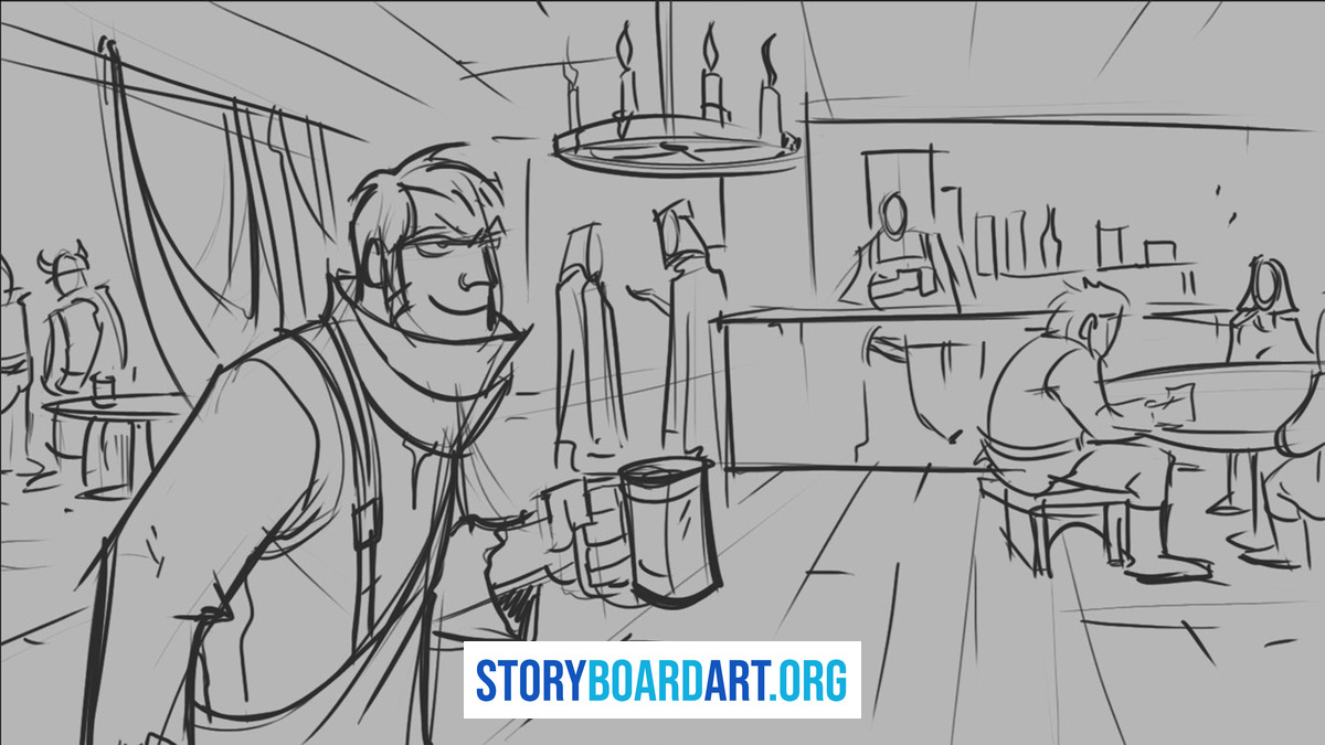
Thumbnail boards are quick, small sketches used early, before any money gets spent on a shoot. Their whole job is to spark debate: does the joke work, is the product reveal timed right. If your thumbnails look finished, you've actually messed up — you made the room admire your art instead of test the idea. That's why thumbnails matter in your portfolio: a tight sequence shows you think in beats, not just pretty moments.
Example: a beat-driven five-panel sequence
As an illustration: a 15-second energy-drink spot. Panel one, wide, an alarm clock at 6 a.m. and an empty can on the nightstand. Panel two, medium, a hand reaches past the old can for a fresh one. Panel three, close, the tab pops. Panel four, wide, the room brightens like the sun just arrived early. Four panels, no dialogue, and the joke — the drink speeds up daylight — reads in under two seconds, because the shot sizes are doing the storytelling: wide for context, medium for the choice, close for the payoff, wide again for the punchline. That's a sequence built to be pitched in a room, not admired on a wall.
What makes a strong thumbnail sequence
Two things separate strong sequences from weak ones. First, panel count — the fewest panels needed to set up, twist, and resolve. If you're using ten panels to do what five could, you haven't found the beats yet. Second, shot variety: a wide shot establishes the scene, a close-up sells the key moment. If every panel sits at the same medium distance, you're coasting, not deciding.
Loose thumbnails alone aren't enough, either — add short notes under the row. Mention camera moves, highlight the acting beat that carries the panel. These notes show reviewers every panel was a decision, not a guess. Then show a revision pass: three to five panels, Version A next to Version B. That's what proves you can rework an idea, not just produce one.
The upgrade: take it from boards to timing
Most portfolios stop at drawings. Yours doesn't have to.
Write a simple script — even a 15-second spot idea — board it as thumbnails, then cut those drawings into a rough, timed animatic (boards played in order, cut like a crude video of the storyboard). All you need is a timer and editing software. No client, no budget required. Present the boards first, then the timed cut — reviewers will see your process, and that's worth more than another gallery of panels.
The mistake that kills this section
Watch for two failure patterns. First, thumbnails masquerading as illustrations — if each panel took an hour and looks polished, you weren't making sequencing decisions, you were drawing small pretty pictures. Second, a row of identical medium shots — a wide followed by five mediums isn't a sequence, it's a habit.
2. Traditional boards: how to prove you can stage a whole spot
The client said yes to the idea. So why does the next board look nothing like the thumbnails? Because the job changed — thumbnails test ideas, traditional boards lock the shoot plan. This one comes after thumbnails and before shooting boards or animatics, and its whole job is to freeze the visual plan so nobody argues on set.
Example: a 30-second SaaS spot, staged to shoot
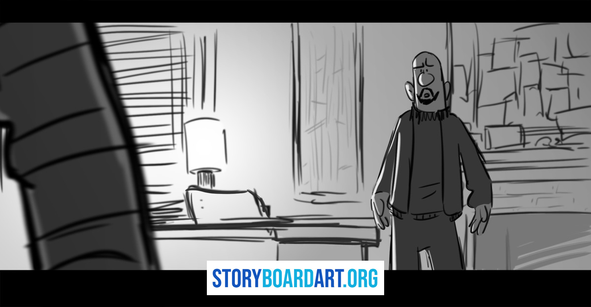
As an illustration: a 30-second SaaS ad about expense reconciliation. Panel one, wide interior, a manager buried under paper receipts under hard, cramped light. Panel two, medium, a laptop opens and the screen glow replaces the desk lamp. Panel three, close on the interface as the numbers auto-sort. Panel four, wide, the same office, now open and bright, the manager leaning back. A margin note marks a slow push on panel three, where the product does the work, and a caption underneath states the objective, the audience, and the problem solved — one line each. That's the difference between a board a crew can shoot from and a board that just looks nice.
Three things to study in every board
Open any real ad board and the panel-to-panel action is easy to follow, even fast — small arrows for pans or pushes only when the motion isn't obvious, text short and rare, nothing decorative. Every mark earns its place because crews read it fast, on set, standing up.
Turn the sound off first. Can you still follow the spot from the panels alone? Check continuity next — eye-lines and screen direction have to stay consistent, or viewers get lost even if they can't say why. Then find the product: when does it enter, how long does it stay, what does the camera do to hold it? A board that fumbles the product moment fumbles the ad's whole purpose.
Building the version that gets you hired
A gallery of pretty panels won't prove you can do this job. Build one 30-second sequence with a real turn — a setup, a complication, a payoff, not just a montage of nice moments. Under it, add a short caption block: state the objective, audience, and the problem the ad solves, one line each. That's what tells reviewers you understand persuasion, not just decoration.
Most portfolios board consumer spots — coffee, sneakers, trucks. Board one B2B or SaaS-style sequence instead and you'll stand out: since the product is invisible, show cause and effect. Draw a before state — the friction — then an after state, the relief once the product works. Stage interfaces as props the camera moves toward, not tiny screenshots jammed in a corner.
What kills a traditional board
Two failure modes show up constantly. First, over-rendering — a board that took three hours per panel looks slow, and slow reads as inexperienced. Second, dialogue-heavy boards where the picture never actually changes. If panel four looks like panel three except for the words underneath, you've written a script and called it a storyboard. The Animation Guild represents the artists who build these boards for a living, and their members will tell you the same thing — static panels are the fastest way to get sent back for revisions.
3. Photoreal and CGI boards: how to show a client "the final" before anyone shoots
A board this polished shouldn't exist before the shoot. So why did someone spend two days rendering it? Because on big-budget spots, lighting and materials are the pitch. Photoreal boards look almost like finished frames — they exist so clients approve the mood before anyone even sets up lights. Thumbnails sell ideas, traditional boards lock plans, photoreal boards sell looks.
Example: locking a look before a shoot day is booked
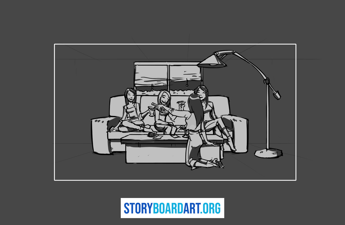
As an illustration: a beverage client wants to see the bottle before committing to a shoot. Panel one, wide and moody, the bottle in crushed ice under one hard key light, condensation catching a rim light. Panel two pushes closer — same lighting ratio, same reflection pattern on the glass, the label perfectly legible. Panel three pulls back to a hand lifting the bottle, same light, same label orientation. The story doesn't move across the three panels; the entire job is proving the look holds together before a single light gets rented.
What to study in a photoreal sequence
Start with light. Can you tell the time of day and mood — a hard, low sun feels different than a soft, cloudy glow. Then check the product: does the shape stay the same, do labels sit consistently, do reflections behave the same across frames? Every product has a hero angle, and it needs to stay locked. If the bottle looks slightly different in panel three than panel one, the people you're trying to impress will notice.
The most common mistake here is mistaking photorealism for storytelling — a set of gorgeous frames with no clear progression is design work pretending to be a storyboard. If viewers can't tell what happens from panel one to panel three, the polish won't save it. The same shot-variety and sequencing rules from traditional boards still apply.
Presenting this without faking a shoot
Here's where students mess up: they post twenty separate renders and call it a portfolio piece. That just reads as a gallery of pretty pictures, not boarding. Present photoreal work as a preproduction deliverable instead — a few styleframes paired with a short sequence that tells a story. Add notes under each frame: key light direction, rim light behavior, how the background keeps the label readable.
The gap most competitors skip: AI-assisted storyboarding
AI tools can generate reference images and styleframes fast now. Use it to speed up idea testing, but lock consistency with a product reference sheet showing the product from every angle you'll need. Without one, AI will quietly change labels, shapes, or reflections, and you'll only notice when a client does. Be honest about what it actually does: it speeds up options, it doesn't replace taste. Someone still has to decide which option serves the story — that decision is the real job.
4. Animatics and social-first boards: timing is a creative choice
A board can look perfect on paper and fail on set — and no one finds out until the crew's standing there with nothing to shoot. That's the expensive way to learn a timing problem. The cheap way is an animatic: your boards cut together with rough timing, playing like a crude video of the storyboard.
Example: a nine-second vertical spot, timed
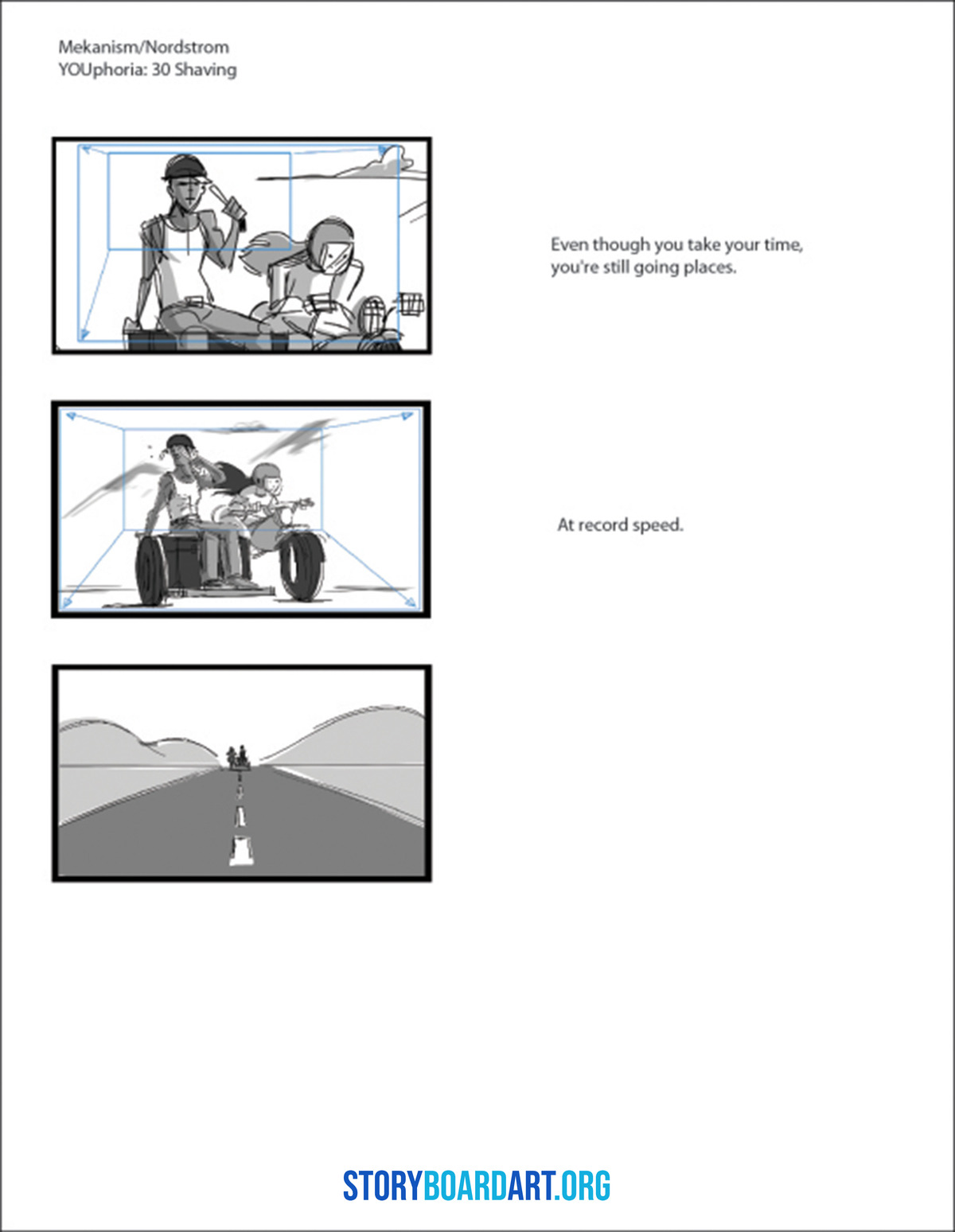
As an illustration: a nine-second vertical spot for a skincare brand. Panel one, a tight, handheld-feeling close-up of a hand applying product, with a safe zone left clear for where the caption will sit. Panel two, still close, the label turns into frame for one beat. Panel three, medium, a reaction to camera. Cut into an animatic and watched with the sound off, the whole thing has to read as native to the feed in under ten seconds — that's the actual test, since an autoplay ad with no sound lives or dies on whether panel one alone stops a thumb.
What an animatic catches
Animatics catch three problems before they cost real money: bad pacing, unclear messaging, rough cuts. A board can look fine on paper and still run wrong — maybe a joke needs an extra beat, maybe the product shot arrives half a second too late. A timing problem caught here costs an afternoon of editing. The same problem caught on set costs a reshoot.
Find the moment the idea becomes obvious — a good animatic makes the viewer understand the joke within seconds, no narration needed. Watch the handoff between story beats and product beats: a clean handoff feels earned, a clumsy one feels like the ad suddenly remembered it needed to sell something. And watch the rhythm — where does the cut hold to let a shot breathe, where does it cut fast to build energy.
Why social and UGC ads board differently
A TV-style board just doesn't map onto a vertical, social-first ad. Vertical format changes the frame entirely — plan a safe zone, the part that stays clear of captions and platform buttons, or your board gets cropped once it goes live. The first second matters more here than almost anywhere else: most social video autoplays with the sound off, so your first frame has to communicate with no voiceover or music.
UGC-style ads are built to look like user-generated content, not polished commercials — many of the best-performing ones live or die on the edit and a performer talking straight to camera, not production value. Boarding this kind of spot means planning line reads and cut points, not camera moves and lighting.
Presenting this as a portfolio piece
Include the animatic — the file or an embedded video — with the boards laid out underneath. Add a paragraph explaining what changed once you timed it: what you cut because it dragged, what you reordered because the product beat landed too early. That's what shows reviewers you can revise your timing, not just execute a first draft.
If the production needs shooting boards once timing's locked, keep that layer readable too — camera move arrows and crew notes are there to support the shot, not bury it under text.
Frequently Asked Questions
How many panels should a 15 to 30 second ad storyboard have?
Most spots land somewhere between eight and twenty panels, depending on how many shots the spot actually needs. Count your beats first, then build one panel per meaningful change in shot, action, or emotion — a sequence that needs forty panels to say what fifteen could isn't thorough, it just hasn't found its beats yet.
Should I include the final commercial next to the storyboard?
Yes — if you own the rights and the spot actually got made. Seeing your board next to the finished ad is the strongest proof you can offer. If no final exists, show your animatic instead and label it clearly as self-assigned work.
Can I put AI-assisted boards in my portfolio?
Yes, as long as you're upfront about what the AI did and what you did. State plainly which sequencing, staging, and shot decisions were yours — reviewers are hiring your judgment, not your prompt. Watch for continuity drift, where a product's shape, label, or color shifts from panel to panel.
What's the difference between a storyboard, a shooting board, and a styleframe deck?
A storyboard plans a scene panel by panel to lock the visual story before shooting. A shooting board adds camera moves, shot numbers, and crew notes for use on set. A styleframe deck is a small set of polished single images that establish a look, usually for client approval.
I have strong drawings but no ad or studio experience. What's next?
Build three to five complete sequences, each with a real setup, turn, and payoff. Get someone in the industry to tell you honestly why they do or don't read, revise, and repeat. Drawing skill isn't the gap — sequencing judgment is. For the full breakdown, read the Killer Storyboard Portfolio guide.
