I used to think my boards were good because people said the drawings were good. Clean lines, figures that held up, panels I was genuinely proud to show off. Then a recruiter flipped through my sequence in about eleven seconds, nodded, and said "nice style" before moving on. Nothing about whether the scene actually worked. That was the moment it clicked: nobody was learning anything about whether I could direct a shot. They were just admiring a sketchbook.
Here's the thing nobody tells you when they hand you a list of storyboard examples for film to study: you are not supposed to copy the drawings. A professional board is a set of instructions, not art you hang on a wall. It tells the camera operator where to point, tells the editor where to cut, and keeps the scene continuous from panel to panel. Every panel is a decision, and studying examples really just means learning to spot that decision.
This piece gives you three original film-style storyboard example sets to model, plus what a story supervisor checks first on each one. We'll start with the scene almost every portfolio has, and almost nobody boards well: two people talking, still needing real coverage.
1. A two-person dialogue scene, boarded for the cut
Most dialogue boards fail before the drawing even starts. The artist picks a medium shot, stays there the whole scene, and calls it done. Here's what should happen instead.
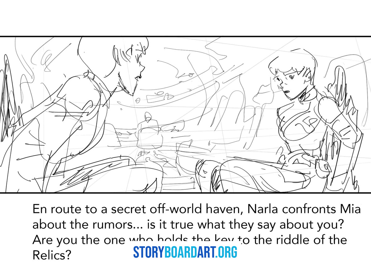
This example is an original storyboard for a short talk between two people in one room, built to cut into an animatic. An animatic is a rough video of the boards played in order with timing, so a team can feel if the scene works before anyone animates a frame.
Why this setup works
The first job in any dialogue scene is geography. The audience must always know where the two people stand, which way they face, and where the camera sits. You set this once, in a wide shot, and you don't touch it again unless something changes, like a character standing up or a third person walking in. If nothing changes, don't reset the wide. Cutting back to it for no reason wastes a panel and tells the reader you don't trust your own staging.
Once geography is locked, build your coverage. Coverage is the set of shots that lets an editor cut the scene together. For a two-person scene, you need five things: a master shot showing both people, over-the-shoulder shots favoring each character in turn, clean singles on each face for the important lines, one insert, and the shot that gets skipped most often, the answer shot. An insert is a close-up on an object the scene needs but doesn't need a face for, like a phone or a clenched hand.
The answer shot is a reaction shot placed at the exact moment the scene's meaning flips. If your sequence has no shot dedicated to a face reacting to the line that changes everything, you haven't boarded the scene. You've boarded the dialogue.
What the panels show
The visuals pair a rough thumbnail strip with cleaned panels next to it. The thumbnails are small and messy on purpose, because that's the stage where you solve the scene. The clean panels are the same shots and staging, just readable. Seeing both together proves the thinking happens in the thumbnail, not the rendering. Eight to twelve panels carry the full cut logic here. Thirty panels won't prove you understand coverage any better than the right eight will.
Each panel carries a shot label: WS for wide shot, MS for medium shot, CU for close-up, OTS for over-the-shoulder. It also carries camera height, whether the camera sits at eye level, low, or high, plus any camera move, a pan, tilt, or dolly, and a short line describing the action.
One continuity note goes on the panel that would otherwise wreck the shoot. Write an eyeline note confirming which way each character looks, or a screen direction note confirming which side of the frame each character stays on. Skip that note and a director on set has to guess. That guess is exactly what a professional board exists to prevent.
Steal this checklist
Apply this to any dialogue scene: one establishing wide, one pressure close on the line that hurts, one reset wide only if something changed, and one insert that earns its place instead of decorating the page. To grow this into a full sequence of thirty to sixty panels, don't add filler coverage of lines that don't matter. Add a second beat instead, a moment where one character decides something, and repeat the same coverage logic around it. More story, not more shots of the same story.
2. An original action sequence, boarded to keep the audience oriented
Action boards fail for a reason nobody warns you about. The board looks exciting panel by panel, then the reader loses track of who is where. A chase or a fight only works if the viewer never has to stop and rebuild the space in their head. That's the real job here, not the punches or the sprint. Orientation.
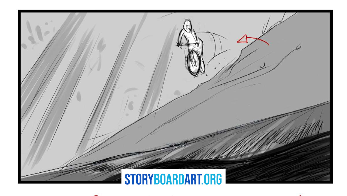
This example is an original chase beat, planned the way a professional would plan it. Figure out the space first. Then figure out the shots.
Why this works
Every action sequence needs one thing that stays the same across cuts. Call it an orientation anchor, maybe a doorway, a building on the skyline, or a character's jacket color that reads even in a blur of motion. Cut from a wide shot of a rooftop chase to a tight shot of a hand grabbing a ledge, and the anchor tells the audience they're still watching the same chase, in the same place. Lose that anchor for too long and the sequence turns into unconnected pieces of motion.
The second rule is shot economy. Every panel must teach the audience something new: a new position, a new obstacle, a change in who's winning. If a panel just restates the last one with more speed lines, cut it. Action boards do not improve by adding panels. They improve by adding information.
What the panels show
The visuals include a "same shot, multiple panels" moment. One camera position holds across three or four panels while the pose changes underneath it, showing a single move broken into readable steps, like a punch landing or a jump starting and finishing, without changing the camera every panel.
Arrows appear too, and they mean two different things. An arrow on a character shows where that character is about to move. A separate arrow, drawn differently, shows where the camera itself is about to move. Mixing these up is one of the fastest ways to confuse a crew reading your board on set.
Production notes that make it shootable
A real action board carries notes most people never think about. Safety and coordination notes mark where the stunt physically happens, what must be protected on set, and what needs a clean plate, an empty background shot handed to visual effects later.
Editorial needs notes too. Is this a smash cut, a hard cut with no transition? A match action cut, where motion flows directly from one shot into the next? Or a whip pan, where the camera blurs sideways to hide the cut? Each choice changes how you draw the panels around it.
The common failure
The most common action board mistake is cutting wide to wide to wide, or close to close, with no reset. A run of identical shot sizes goes flat fast, and action sequences punish that flatness harder than dialogue does, because the audience is also trying to track motion, not just conversation. Label ten panels from your own action sequence W, M, or C, and check the string for accidental monotony. If three or more identical letters sit in a row with nothing new happening, you found your fix.
3. A fixed-length montage sequence, boarded for beat and cut
A montage board can look fine as single panels and still fall apart the second you time it. Twelve pretty drawings can add up to nothing, because nothing in the row tells you when a beat lands. Here's the fix, and it has nothing to do with drawing better.
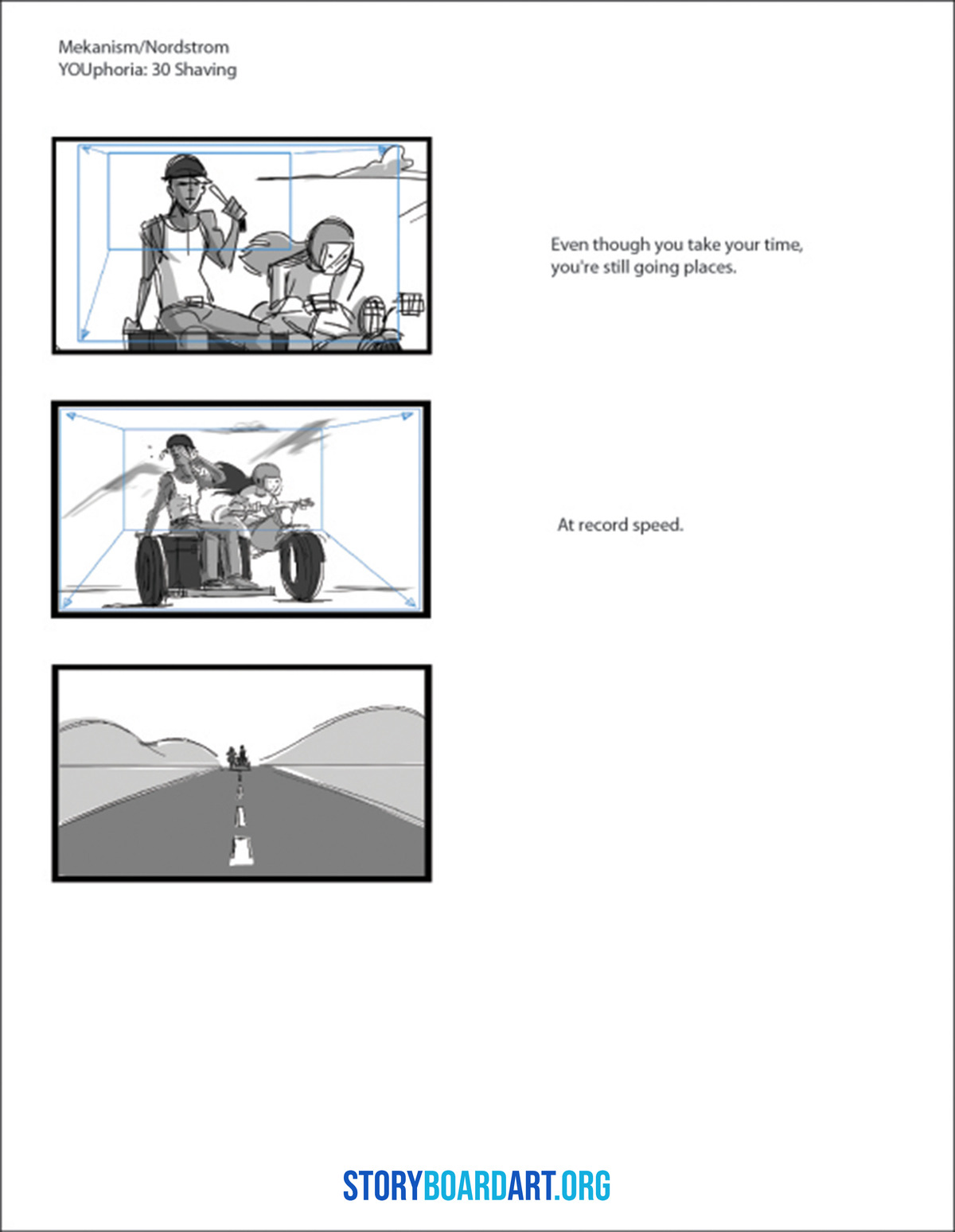
What this example is
This is an original montage sequence built to a fixed runtime. Thirty seconds, on purpose. A real number forces real decisions. You can't fudge timing when a clock sits right on the page. This is also the discipline studios expect once your boards move into an animatic, so a team can feel the scene before anyone animates a frame.
Why it works
A montage lives or dies on its beat map. A beat map is a simple list of what changes at each moment and why the cut happens there. Beat one might show a character failing at something. Beat two shows a small win. Beat three pays it off. Every beat needs one clear idea, and if you can't say what changed in one sentence, the beat isn't working yet.
The second rule is readability over detail. Montage panels move fast on screen, sometimes under a second each. Nobody reads fine rendering at that speed. Simple silhouettes, clear poses, and staging that reads instantly carry the sequence. Detail is wasted effort here. Clarity is not.
What the panels show
A beat sheet line sits above the panel row: Beat 1, Beat 2, Beat 3, each tagged with a timecode. This one addition turns a strip of drawings into a plan someone else can follow without you standing there explaining it. The panels also repeat the same framing on purpose across two or three beats in a row, then break it once, hard, for the beat that matters most. That break only works because everything before it stayed consistent. Repetition builds the pattern, and the one broken panel is where the audience feels the shift.
Every panel carries a duration, how many seconds it holds on screen, an audio cue note if music or sound drives the cut, and a transition type. A match cut lines up motion or shape from one panel into the next. A graphic cut lines up color or composition instead of motion. Say which one you mean directly on the page. Don't make an editor guess your intention.
This exact structure works for a commercial or a music video, just compressed. Swap "beats" for "shots that need to land inside fifteen seconds" and nothing else changes. Short-form work punishes wasted panels even harder than a full montage does, because there's less runtime to hide a mistake in. If a panel doesn't change the story or the rhythm, cut it. A tight ten-panel montage beats a bloated twenty every time it gets timed against a clock.
4. A tension build and an unscripted coverage plan, boarded two ways
This example has two boards. Neither one shows exact action from start to finish, and that's on purpose. Most sites show you "horror storyboards" or "documentary storyboards" like the trick is picking a scary subject or a real location. It's not. The real trick is knowing what you can plan tightly and what you can only plan loosely, then boarding each one the right way.
Part A: the tension build
Nothing happens for most of this sequence. That's the point. Tension comes from shot progression, not a scary image. You withhold information, narrow the frame, then release it.
The panels show a slow push from a wide shot to a close shot. One small object repeats in almost every frame, maybe a hallway light, a half-open door, or a toy on the floor. At first it reads as nothing. By the last few panels, after the frame has tightened around it again and again, it reads as a threat. The object never changed. Only your distance to it did.
The notes matter as much as the drawings. Each panel has a sound cue, because horror timing lives in silence and sudden noise as much as in the image. One panel near the end is marked for clean negative space: empty room in the frame with nothing drawn in it. This space is left blank on purpose. It's where the reveal lands. A board that fills every inch of every panel gives the director nowhere to put the shock.
Part B: the coverage plan board
This half looks nothing like Part A, and that's the second lesson. This is a documentary-style, unscripted coverage plan, boarded before a shoot where nobody can say exactly what will happen, like an interview or a real event at a location nobody controls.
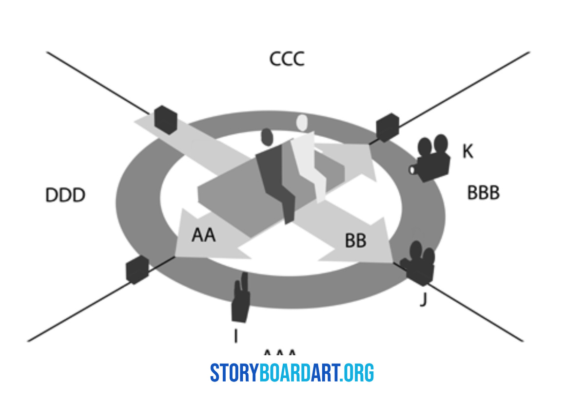
You can't storyboard what a real person will do, so you don't try. Instead, you board the space and the likely moments. This panel set includes a location diagram, a simple overhead map showing where the camera can sit and where the subject is likely to move. It also includes four to six "if this happens" panels: a wide safety shot to grab no matter what, a reaction close-up in case the subject gets emotional, and a cutaway to hands or an object if the room goes quiet.
This board carries a priority list instead of a shot list. It splits into must-have coverage, the shots the operator gets no matter what happens, and nice-to-have coverage, the shots worth grabbing if there's time. A crew reading this on location knows instantly what they cannot afford to miss.
Why both halves belong in one portfolio
A tight tension sequence tells a recruiter you understand pacing and withholding. That's directing instinct, not drawing skill. A coverage plan tells them something rarer: that you understand not every shoot can be fully scripted, and that you know how to plan for that instead of pretending it doesn't exist. Most portfolios show neither. A coverage board that looks impressive but that a crew could not actually follow on the day is a drawing exercise wearing a production board's clothes. If your must-have list isn't something an operator could shoot without you standing there, redo it before you call it done.
Frequently asked questions
Do I need to draw well to make a professional storyboard?
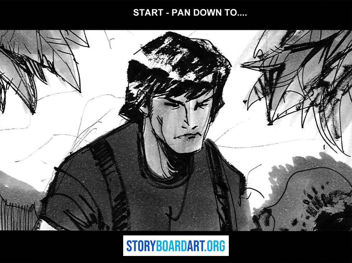
No. You need to be clear, not skilled. Clear means the reader always knows where the camera is, where the characters are, and what happens next. That's called continuity, and it matters more than pretty lines. Good drawing helps you work faster and show acting on a face with fewer strokes, but early on, rough thumbnails with simple stick-like figures are fine, as long as nobody has to guess what the shot is doing.
What should be written on each storyboard panel for film?
Every panel needs six things at minimum: the shot type, the camera move, the action happening, the dialogue or sound, how long the panel holds on screen, and the transition into the next panel. Beyond that, add optional notes when they matter: lens intent, camera height, visual effects notes, and prop continuity so nothing changes accidentally between panels.
Can AI-generated storyboard frames replace storyboard craft?
No. An AI tool can make a frame look finished, but it can't make production decisions. A pitch-pretty frame is not the same as a set of instructions a crew can shoot from. The right order is shot list first, references locked second, AI frames last if you use them at all. AI can speed up rendering. It cannot decide where the camera sits, when to cut, or where the eyeline goes. Those choices are the job.
How do I turn "storyboard examples" into a portfolio recruiters respect?
Build sequences, not single panels. A recruiter needs thirty to sixty panels of one scene to judge whether you can direct a cut, not one nice-looking frame. Include at least one slice that shows your process, a rough thumbnail next to the same panel cleaned up, so they see the thinking, not just the finish. Then package one sequence as an animatic or a timecoded PDF, so it plays like a real production document instead of a gallery.
If your current portfolio is a set of single panels with no sequence, no timing, and no process shown, that's the fastest reason you're getting silence instead of callbacks. Go audit it against a real standard before you send it out again. Anyway, that's what this whole guide is really about. Read the full portfolio guide here.
