Contents
- Thumbnail sketch definition
- How thumbnailing works in a storyboard workflow
- How big should a thumbnail sketch be?
- What to include in a storyboard thumbnail
- Digital thumbnailing: fast moves paper can't do
- How many thumbnails to draw (without losing your mind)
- Picking winners: a supervisor's checklist
- Showing thumbnails in portfolios (without looking amateur)
- Common time-wasters
- FAQ
You can draw. Your fundamentals are solid. Yet when you step back, the sequence just doesn't work, and you can't quite say why.
Here's the fix most people learn too late. A thumbnail sketch is not a throwaway warm-up exercise, but a fast, disposable drawing that solves problems before you waste hours on the wrong shot. This is where the real decisions happen: framing, camera angle, shot progression, all while mistakes still cost you nothing.
By the end, you'll know exactly how to use thumbnails, from drawing them fast to picking the winner that becomes your final board. First, let's kill a common myth.
Thumbnail sketch definition
A thumbnail sketch is a small, fast test of your big decisions. It checks framing, staging, value structure, and focal points. You make several deliberately rough versions and pick whichever works best at a glance.
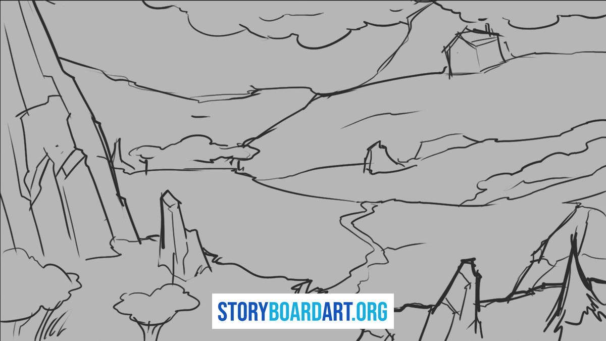
Storyboard thumbnails aren't about pretty drawing. Their only job is to prove a sequence reads clearly panel-to-panel before you sink time into it.
Three key terms come up constantly, so it's worth defining them plainly. Staging means where characters and camera live in the scene: who stands where, and where you're watching from. Value read means how well the scene works when reduced to nothing but light and dark shapes, no color or line to lean on. Silhouette means the black shape that defines a character's action, the outline someone could recognize even in a shadow.
A weak thumbnail tries to do all three badly at once: staging that's ambiguous, values that are all one gray mush, a silhouette that reads as a blob. A strong thumbnail nails one clear idea. You look at it for two seconds and know exactly what's happening and why the camera is where it is.
When you start polishing lines, you've crossed into rough boards. That's someone else's problem now, thumbnails are just for you.
How thumbnailing works in a storyboard workflow
Do this and you'll stop flushing time down the drain.
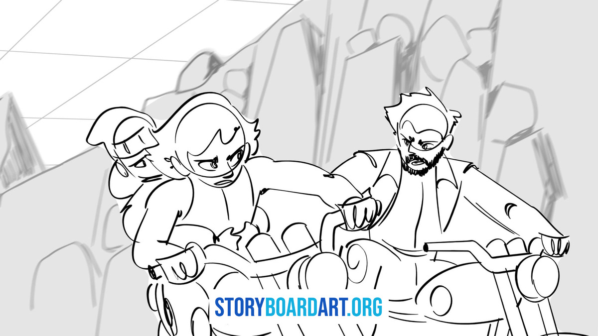
1. Lock the frame first Aspect ratio is everything. If your final delivery is 16:9, that's the wide TV and streaming shape, your thumbnails must match. Draw a page of empty rectangles with breathing room for notes. Do this before you sketch a single figure. A thumbnail drawn in the wrong proportions teaches you nothing, because the composition you're testing won't survive the resize.
2. Generate options brutally fast Draw 5 thumbnails when you're stuck on a shot. Draw 10 or more when your ideas feel stale or the beat really matters. Clock yourself: 30 seconds to 2 minutes max per sketch. Longer means you're rendering, not problem-solving. Set a timer if you have to. The drawing itself matters less than the decision it forces you to make.
3. Only draw what matters Clear silhouettes. Basic staging that shows who's where. A single focal point. Background should be just enough to understand the space, nothing more. A good version of this step looks like three or four shapes and a horizon line. A weak version looks like a finished illustration you spent twenty minutes on and now feel too attached to throw away.
4. Value check when needed Use 3 flat tones max: light, mid, dark. Fill in the shapes fast, don't blend or shade. If the scene doesn't read instantly with just those three tones, the thumbnail fails, and no amount of extra rendering will save it. Redraw the staging instead.
5. Narrow ruthlessly Circle 2 to 3 winners from your batch. Tweak one thing on each: a tighter crop, a wider angle, a different camera height. Then pick your champion. Don't tweak all of them at once, that just multiplies your decisions instead of narrowing them.
6. Scale up smart Your rough board keeps the same bones as the winning thumbnail. No redesigns allowed at this stage. If you find yourself redesigning, that's a sign the thumbnail wasn't actually settled.
Skip this and you'll pay in redraws, which cost 10x more time than thumbnailing ever will.
How big should a thumbnail sketch be?
People want exact dimensions. Here's the truth: size barely matters. Shape does.
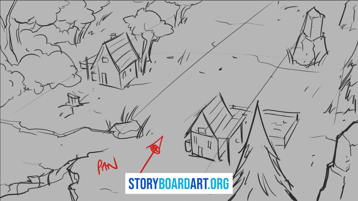
A thumbnail just needs to stay small enough that you keep moving fast. 3cm x 5cm is fine, but matching your final aspect ratio is mandatory. Draw random squares now and you'll redraw everything later when scaling up to rough boards.
Think about it in practical terms. A row of six thumbnails across a sheet of paper, each one roughly the size of a postage stamp, forces you to simplify. There's no room to render a face, so you don't. There's barely room for a horizon line and two figures, so that's exactly what you draw. The small size is doing the work of discipline for you.
Pro tip: Make a template with 6 to 12 matching rectangles, all the same aspect ratio as your final delivery. Leave space under each for notes like "W (wide), hero falls." Then squint test it: hold the page at arm's length or blur your eyes slightly. Can you still read every box, tell which one is the wide shot and which is the close-up? Good, that's a working thumbnail. Too big, and detail creeps in whether you want it to or not, and you'll drift into unnecessary rendering before you've even settled the idea.
What to include in a storyboard thumbnail
Only what proves the shot works. Everything else is wasting your time.
Must-haves:
- Clear silhouettes. Can you tell what's happening from pure shape alone, with no other information?
- Basic staging. Who's in front, who's behind, where does the camera sit relative to the action?
- Shot type marked, using W, M, or C for wide, medium, or close.
- One obvious focal point that the eye lands on first.
Optionals, only if needed:
- A 3-tone value pass, but only if lighting is part of the problem you're solving.
- Arrows for movement or eyelines, when the direction of action isn't obvious from the pose alone.
Early in my career, a supervisor called me out for over-rendering thumbnails. I was hiding weak ideas under pretty execution. His note still sticks: "Line only. No tones. No rendering."
A good thumbnail, by this standard, looks almost embarrassing on its own. Stick figures, a box for a car, a scribble for a tree. That's fine. A weak one looks like you spent real effort making it presentable, which usually means you spent that effort avoiding the actual staging problem.
Test it this way: if you can't redraw the thumbnail from memory in 30 seconds, it's too complex. Simplify until you can.
Digital thumbnailing: fast moves paper can't do
Going digital shouldn't slow you down. Most artists let software trick them into details too soon, and that's a workflow problem, not a tool problem.
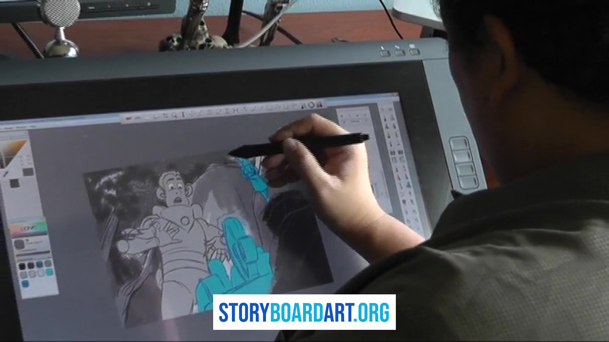
Here's how to stay fast:
- Work on a small canvas with a frame grid that matches your final aspect ratio.
- Keep two layers max: one for lines and silhouettes, one for flat tones.
- Use lasso and nudge tools to test staging in seconds, sliding a character left or right without redrawing them.
- Flip the canvas horizontally now and then. It catches balance and composition issues your eye gets used to.
- Use a rough brush only, and disable pressure sensitivity if it tempts you to fuss over line weight.
This isn't painting. You're stress-testing shot clarity, same as paper, just faster. A good digital thumbnail session produces a dozen rough variations in the time it takes to render one polished panel. A weak session produces two beautifully shaded frames and no real answer about staging.
Golden rule: if you're tweaking endlessly, stop and draw a new thumbnail instead of nudging the old one for the tenth time.
How many thumbnails to draw (without losing your mind)
Draw 5 thumbnails when the clock is ticking. Draw 10 to 20 when your first ideas feel stale or it's a key story beat that deserves more exploration.
Time limits worth holding yourself to:
- Line and silhouette passes: 30 seconds to 2 minutes each.
- Value pass, when you need one: up to 5 minutes.
Quantity matters. Showing multiple options proves you explored before committing, both to yourself and to anyone reviewing your work. But watch for fake variety. If your last 6 thumbnails all use the same camera distance and the same staging, you're not exploring, you're just redrawing the same idea six times and calling it options.
Force real changes between versions:
- Switch shot sizes between wide, medium, and close.
- Move the camera height up or down.
- Reverse which side the action happens on.
- Change what's in the foreground.
I learned this the slow way. Early on, my thumbnails were messy and scribbly. Now I force myself to draw clean from the very first pass, with simple shapes and line work. That simplification increased my speed, because I can make a clear statement quickly and iterate without reworking it in cleanup.
Picking winners: a supervisor's checklist
Generating options is easy. Choosing is the skill. Studios want proof you can pick, not just scribble.
Run this checklist on your circled candidates:
- 2-second read. Can anyone instantly get the action without you explaining it?
- One focal point. Not three competing areas fighting for attention.
- Staging depth. Is there a clear foreground, midground, and background?
- Shot intent. Does a wide shot actually show space, does a close-up actually deliver emotion?
- Silhouette clarity. Does the shape alone sell the action, even with no other detail?
Use a two-pass system. First, elimination: kill any thumbnail that needs explaining out loud, and kill any that's basically a copy of one you already drew. Second, promotion: take your top 2 survivors and redraw each with one specific improvement, whether that's a tighter crop or a clearer eyeline.
Remember, this is communication, not art. If you can't explain your choice in one sentence, you're likely picking emotionally instead of functionally, and that's worth noticing before you commit hours to the wrong panel.
Showing thumbnails in portfolios (without looking amateur)
Studios judge finished sequences. But smart process shots can help, if done right. For a full breakdown of how to build the surrounding portfolio, see this guide to a killer storyboard portfolio.
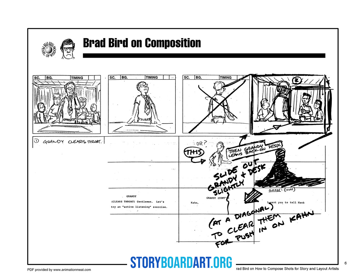
Do:
- Show 4 to 8 key thumbnails max, all from one sequence, so reviewers can follow your thinking start to finish.
- Circle your chosen option so it's obvious which idea won.
- Add one line of context, something like "Testing entrance staging."
- Label each with shot sizes (W, M, C) and which beat it belongs to.
Don't:
- Dump pages of unmarked thumbnails and expect a reviewer to sort them out.
- Render them like finals. That defeats the entire purpose of showing process.
- Make reviewers hunt through your process work to find the finished piece.
Hard truth: if thumbnails are your portfolio's strongest piece, you're not done yet. They're a supplement to strong finished boards, never a replacement for them.
Common time-wasters
Thumbnails only save time if you avoid these traps.
Over-detailing Eyelashes on throwaway sketches? No. Hard rule: line only, timer on, no exceptions for the shot you happen to like.
Analysis paralysis Thirty thumbnails and no decision? You're not exploring anymore, you're hiding from the choice. Pick your top 2, tweak them, commit.
Fake variety Ten versions of the same shot size and staging is one idea drawn ten times, not ten ideas.
Mismatched aspect ratios Draw random shapes now, and you'll redraw everything later when it doesn't fit the final frame.
These feel productive while you're doing them. That's what makes them dangerous, and it's worth checking yourself against this list every time a thumbnailing session runs long.
FAQ
What is the difference between a thumbnail sketch and thumbnailing? A thumbnail sketch is the drawing itself: one small, rough frame that tests a single idea. Thumbnailing is the process of making many of those sketches in a row, so you can compare options side by side and choose the one that tells the story most clearly.
How finished should a thumbnail sketch be? A thumbnail should be clear, not pretty. Line only is usually enough, because the goal is to read the staging and the story at a glance. If you need to test light and dark, keep it to two or three flat tones and stop there.
Should I draw thumbnails digitally or on paper? Use whichever tool keeps you moving fastest. Paper is quick and distraction-free, while digital makes it easy to duplicate, resize, and rearrange panels, so pick the one that lets you get the most ideas down in the least time.
Should I include thumbnail sketches in my storyboard portfolio? Including thumbnails is optional. If you do show them, present them as proof of how you make decisions, next to the finished boards they led to, and never let them become the main event of your portfolio.
Is there a template I can use for thumbnail sketches? Yes. A simple grid of boxes drawn in your project's aspect ratio, with a little space under each box for notes, works for almost every job. Make it once and reuse it for every sequence you board.
